 |
| November 6th Started Coloring this Hope design, afraid the word is getting lost. I think this may just be too busy. |
 |
| Design Nov. 6th |
 |
| Design Nov. 7th Exploring Paisley. |
 |
| 2nd Design Nov. 7th A bit different from my normal designs. I like part of it, but not all of it. However, I do like the more simplistic elements of this design. |
 |
| Design Nov. 8th Discovering Blue Ink. Colored inks seem to look better on this off white paper. |
 |
| Design Nov. 9th Not crazy about how this turned out. I like it better before I colored in the circular area. |
 |
| Design Nov. 10th Another exploration with Paisley. |
 |
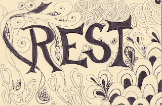
| Design Nov. 11th Originally this was going to say "Respect", I made the letters too big for the paper. I haven't been sleeping well lately, so I thought Rest would be a good reminder for me. |
 |
| Design Nov. 12th Just started doodling, and this came out. I like this one, reminds me of a Sepia Toned print. Reminiscent of the Art Deco period. |
 |
| Today, Nov. 13th, I had a horrible migraine, and the tinnitus coming from my left ear was so very loud. I drew how I was feeling. Not a pretty picture, but it made me feel better to get it out. |
 | |
| http://creativeeveryday.com/art-every-day-month |

I enjoy seeing what you've been doodling! The respect to rest is funny, but apropos. The strength--well the red lines like that made me think of muscles, actually--you know how they show them without skin over them. Powerful.
ReplyDeleteI hope your migraine goes away. They can be so debilitating! I'm surprised you could even draw...but the drawing looks pretty accurate. ;) Feel better! *hugs*
thaks Rita,
ReplyDeleteIt's been a rough week...or more now.
But always trying to draw something helps.
The migraines, well, they have been much worse lately. If I can just do one thing a day, I feel I've accomplished something.
However,
today was a very good day!
I live how you see the Strength drawing! I like it much more now!
wendy
Love the Nov. 12th design. The colour of the ink/pencil against the colour of the paper works really well.
ReplyDeleteAnd I like what Rita saw in the Strength design. Once I read the word muscles, that's all I can think of when I look at it.
Hope you are having better days.
Maureen
Maureen,
ReplyDeleteso funny, Stuart didn't like either of those designs.
What does he know??
I liked the sepia tone look of Nov. 12th too, he said there wasn't enough contrast...say's the geeky computer programmer, who when at museums often says, "I don't get it" or the worst thing he ever said in a museum.."That's not art". Simply because he doesn't get minimalism. There is ART in almost everything!
I do think after being with me for 11 years he's finally beginning to broaden his views on what art is....though he still says http://www.moma.org/collection/object.php?object_id=80385
isn't art.
I admit, it's a bit strange...but it's supposed to be. Just because you don't get it, doesn't mean it's not art.
I think I'd have a hard time saying something isn't art....but, like someone once said, I may not be able to define pornography, but I know it when I see it. Same thing...but I give Art a much wider definition.
pulled my soapbox out again didn't I?
Love seeing your artwork Wendy! I thought the exact same thing as Rita thought...strength looked like muscles to me too. Nov 9 looks like a happy little sperm, and Nov 12 is absolutely my FAV!
ReplyDelete